Branding & Logo Design · 2025
A&F Doctors: Logo and Identity
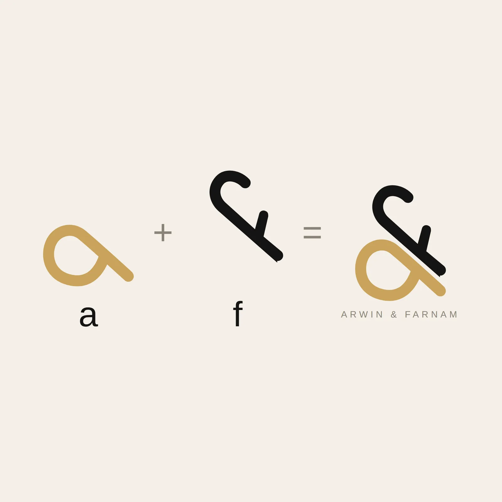
An ampersand that is not one: the practice mark is a lower case a and f, the initials of the two doctors, Arwin and Farnam. Plus wordmark and stationery.


Disziplinen
- Branding
Starting point
Two brothers, one practice, one name: A&F Doctors. The logo had to carry both, without doctor clichés. No cross, no scalpel, no off-the-shelf serif elegance.
Approach
The answer lies in the name itself: the ampersand is built from the initials. A lower case a and a lower case f interlock into an &, drawn in one continuous, soft line. That is medical precision, but warm. Gold and black on cream separate the two letters when you tell the story, and merge into one brand in everyday use.
Result
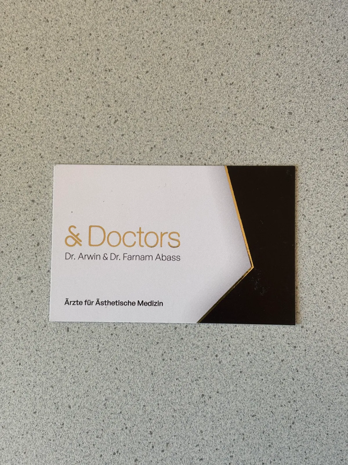
A sign that works on a business card just as well as it does as neon lettering on the practice wall. And one that tells its story in a second, once you have seen it.
The mark
Wordmark
At the practice


















This piece belongs to
- Web design for medical practices
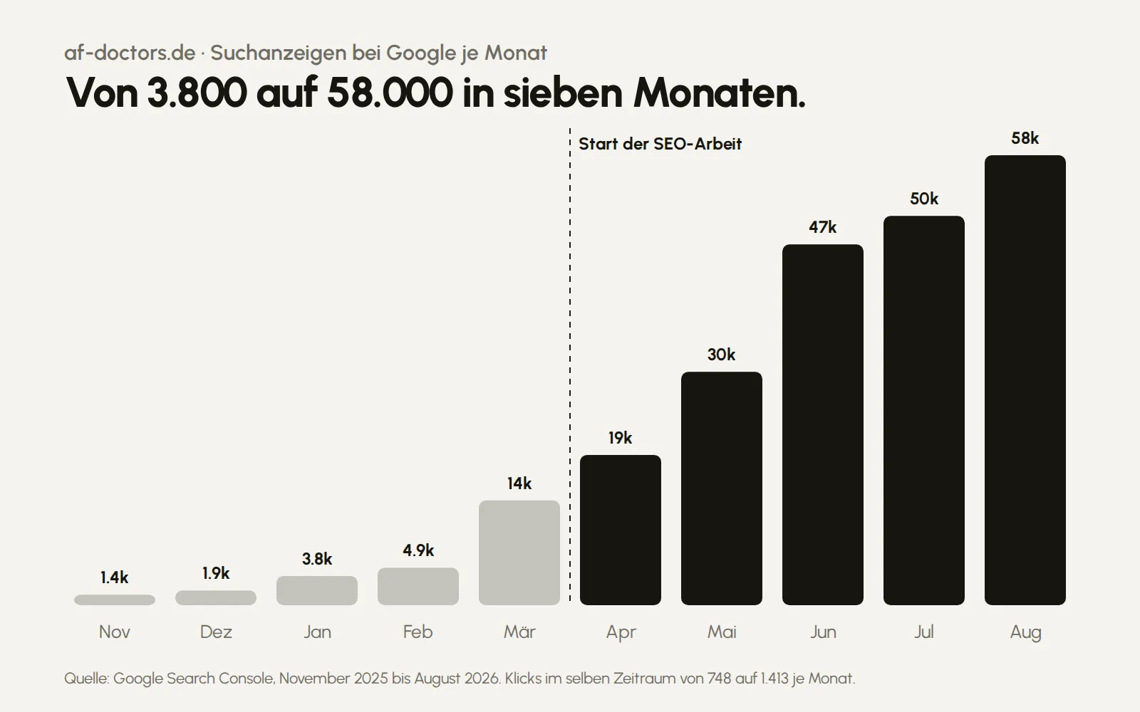
Patients search first, then they call.
- Design & branding
Logo, identity, packaging and print, through to the final file.
These pages say how I build something like this and what it costs.
Planning something similar?
Five questions, about five minutes. That becomes your brief, and you get a quote with phases, prices and a schedule.
Start a project