Logo Design · 2017
Rapresent: Logo for a Music Studio
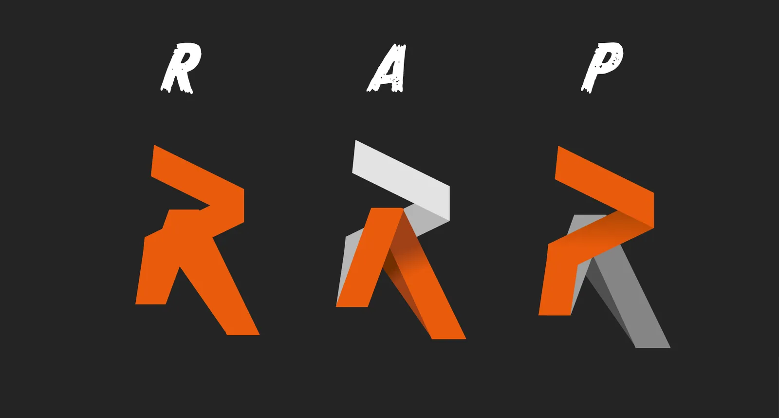
Three letters in one folded ribbon: a music studio's mark reads as an R, with an A and a P hidden in it. Rapresent, with an a, because rap was made here.
Disziplinen
- Branding
Starting point
Rapresent was our music studio, in 2016 and 2017. The studio is gone, the mark stayed. The name is a play on words: represent, but with an a, because rap was made here. The logo had to carry exactly that double meaning, without a microphone, without a boombox, without the usual hip-hop signs.
Approach
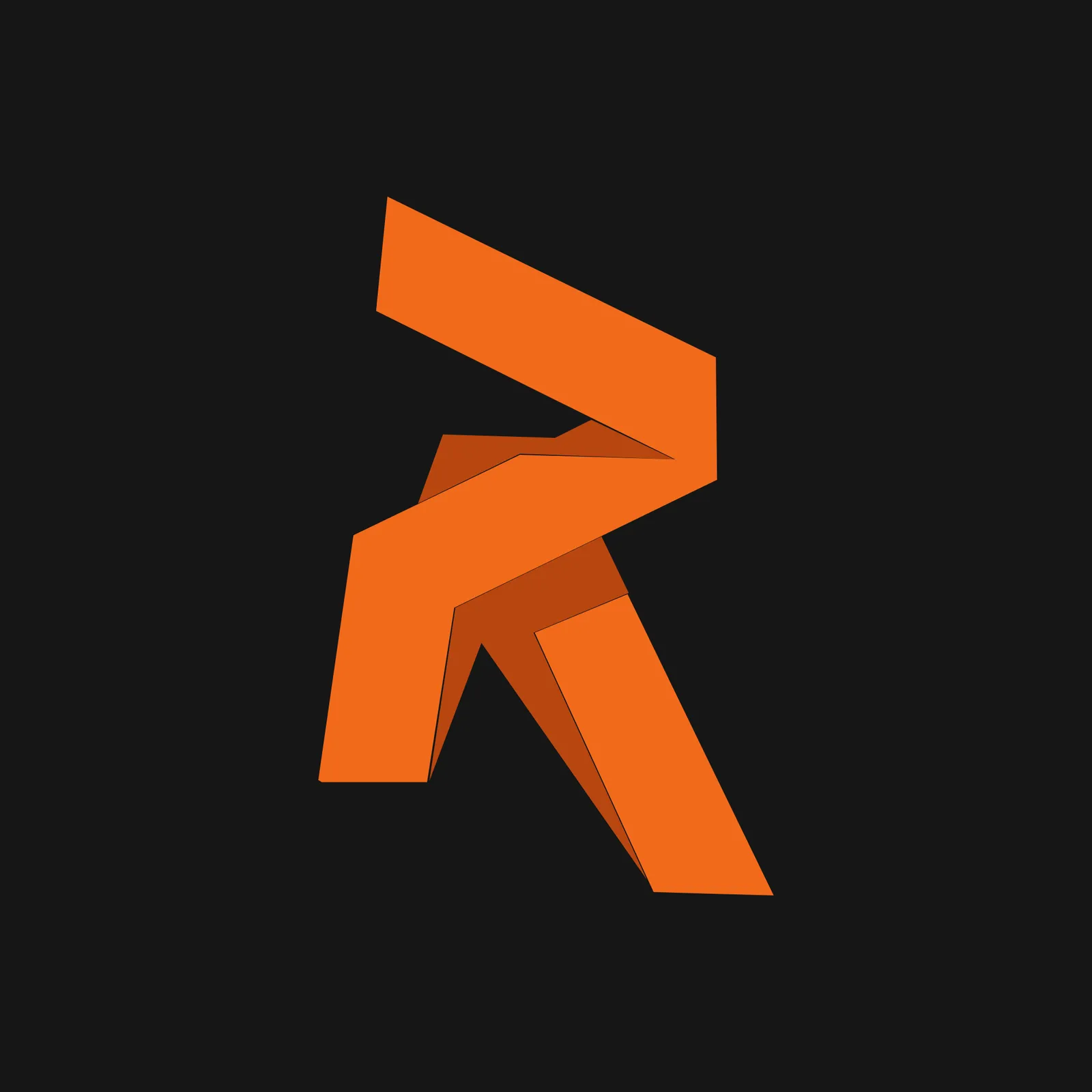
The answer sits in the three letters R, A and P. I thought of them as a single ribbon that folds: the upper curve and the leg form the R. The two legs splaying out at the bottom are the A. The curve on its own, laid over the stem, is the P. Every fold of the ribbon is a change of letter. The folding gives the flat mark depth, which is why it has two shades of orange: the front face and the angled surface in shadow.
Result
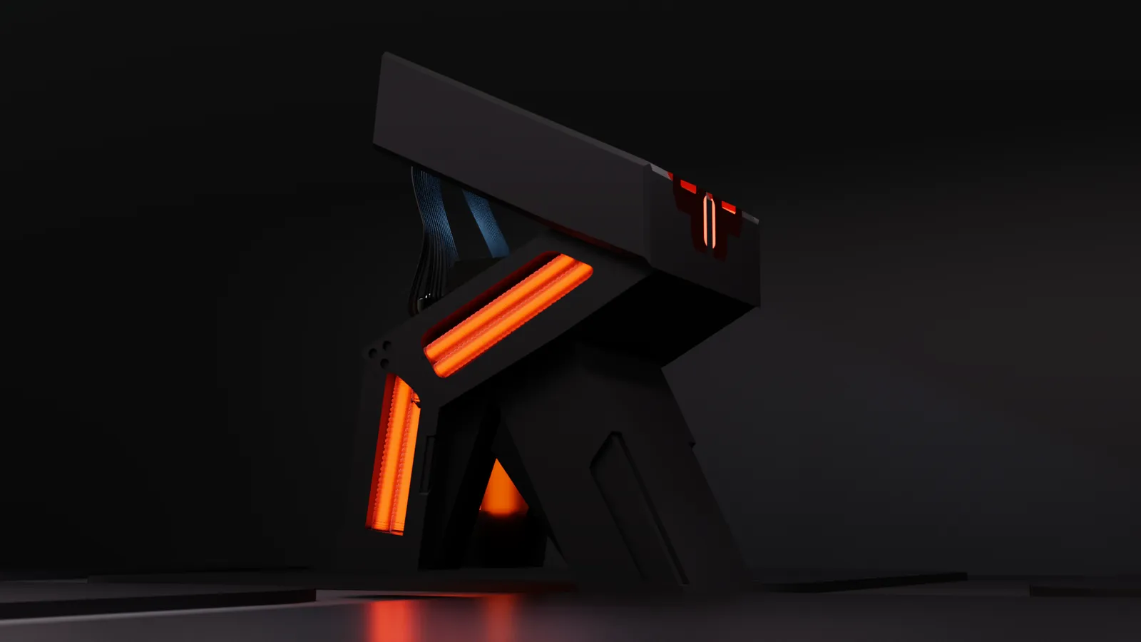
A mark that works as a flat sign on covers and stickers and as a body in space: the folded ribbon later became a 3D object with glowing edges, rendered as an object in a room. For this page I rebuilt the mark as a vector so it stays sharp at any size.


This piece belongs to
- Design & branding
Logo, identity, packaging and print, through to the final file.
These pages say how I build something like this and what it costs.
Planning something similar?
Five questions, about five minutes. That becomes your brief, and you get a quote with phases, prices and a schedule.
Start a project